Transit Gap
A map of where Seattle's transit system costs people time. It draws commute flows between neighborhoods, compares transit travel time against rush-hour driving, and ranks the worst gaps by how many people actually make each trip, so a route that's 3.6× slower for 372 daily commuters surfaces above one that's worse for nobody.
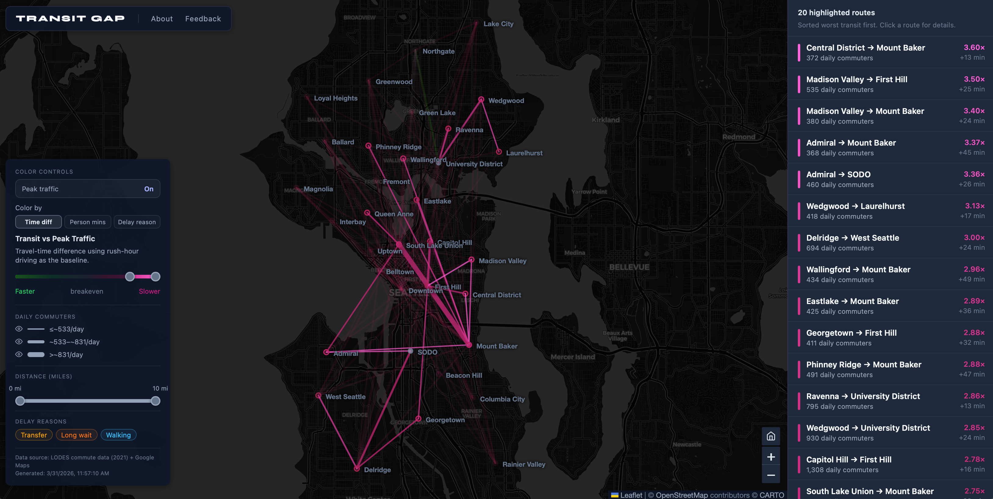
Each delay is broken into its cause (transfer, long wait, walking), and the map filters by commuter volume, trip distance, and delay reason. The color scale diverges around breakeven rather than running one direction, so the routes where transit wins stay visible instead of collapsing into the low end of a ramp.
Travel times are precomputed offline rather than fetched live: a GTFS adapter parses schedule data and takes a percentile over trip durations to get a realistic transit time, a second adapter ingests no-traffic and peak-traffic matrices from a routing API, and a generator merges both with ridership data into a single static feed.
My first project built entirely with Claude Code. I specified the features, made the design and data-model decisions, and reviewed every implementation choice without writing the code myself.
React, TypeScript, Vite, Leaflet over CARTO tiles. LODES commute data (2021) and Google Maps.